ROLE
Product Designer
SKILLS
Competitor Analysis, Redesign, User Interviews, User Testing, Client Feedback
TEAM
1 Product Manager
1 Technical Lead
3 Designers
8 Developers
TIMELINE
FA 24'
3 months
Context
Meeting non-profits at any stage of their growth
Odyssey Fund (previous CHEM) is a free endowment manager for nonprofits provided by Cornell Hack4Impact. Although the designs conceived in its first semester were far from finished.
Features
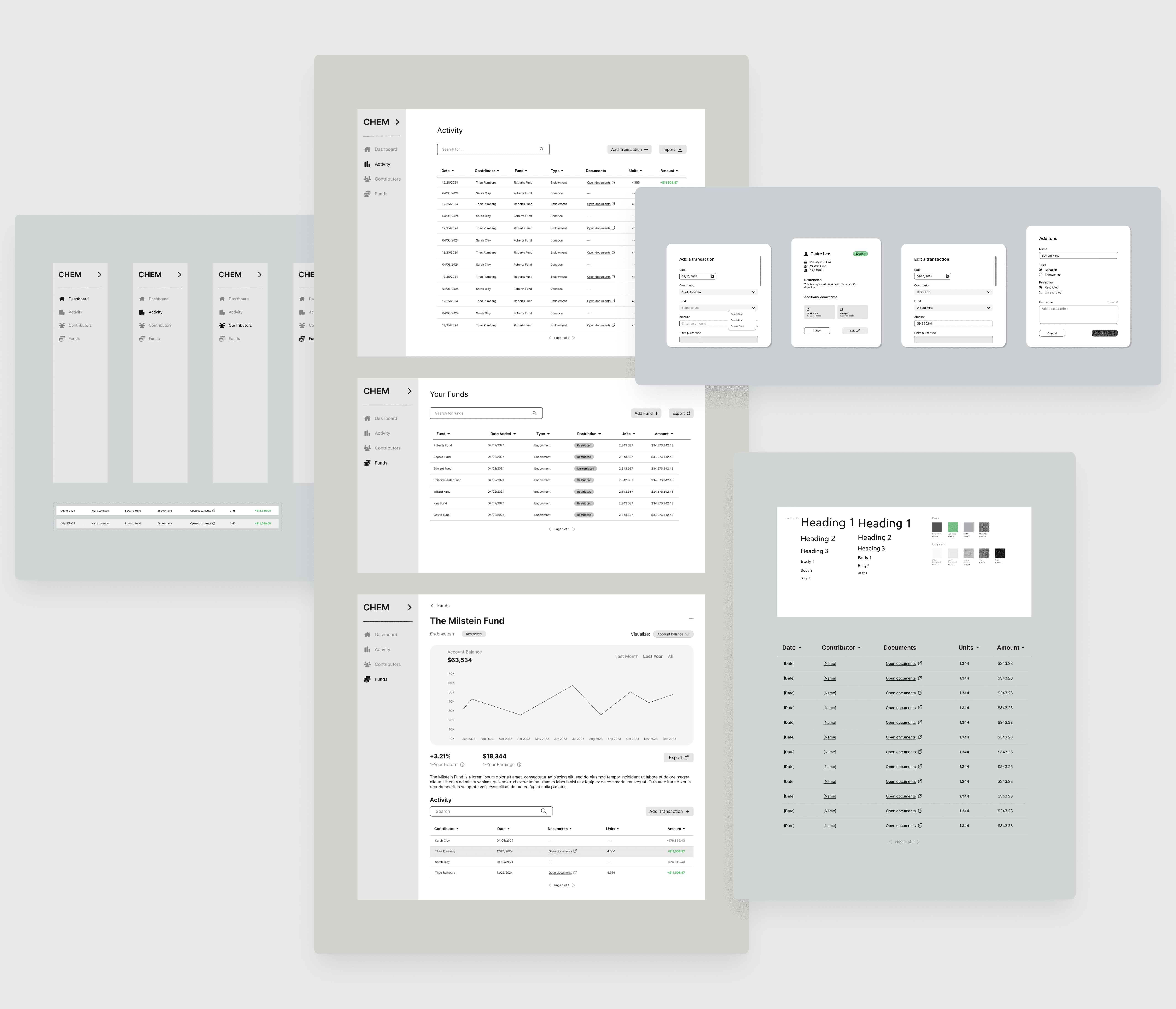
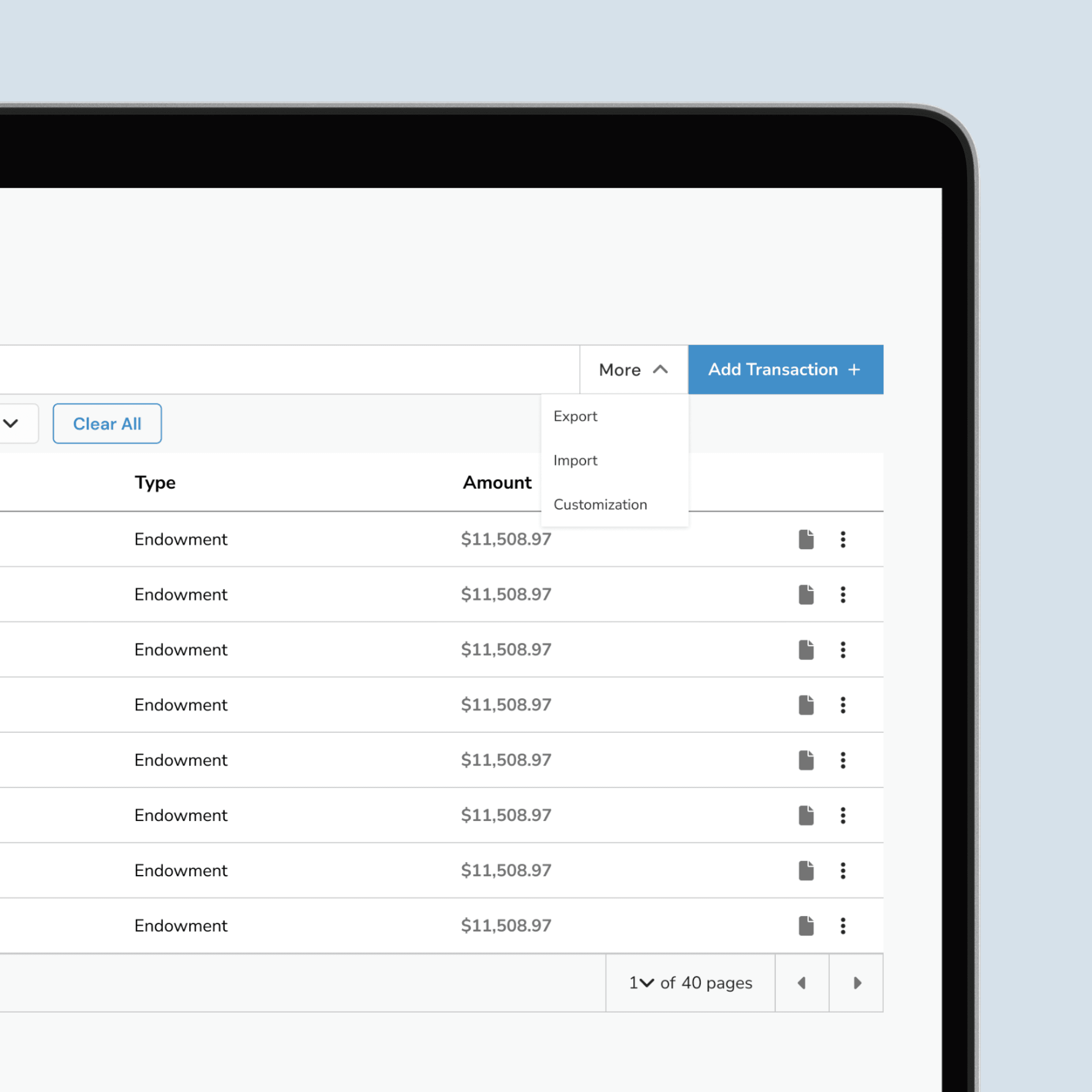
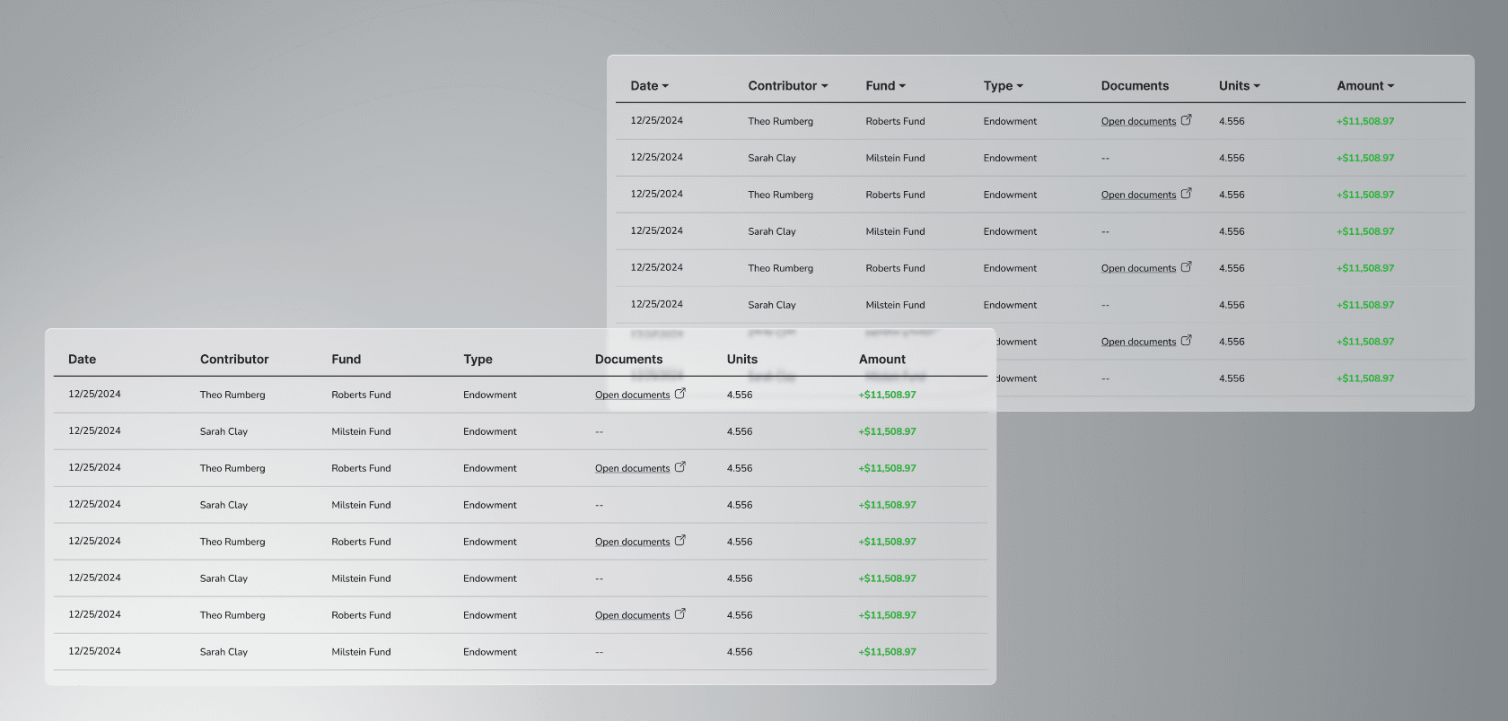
Table Display
The Activity table offers a clear, customizable view of all incoming contributions. You can adjust how many rows appear on screen, quickly scan donation amounts, timestamps, linked documentation, and page through large sets of records with ease. Built-in controls let you edit or delete entries via the ellipsis menu, making it easy to keep data clean and up to date without leaving the table.
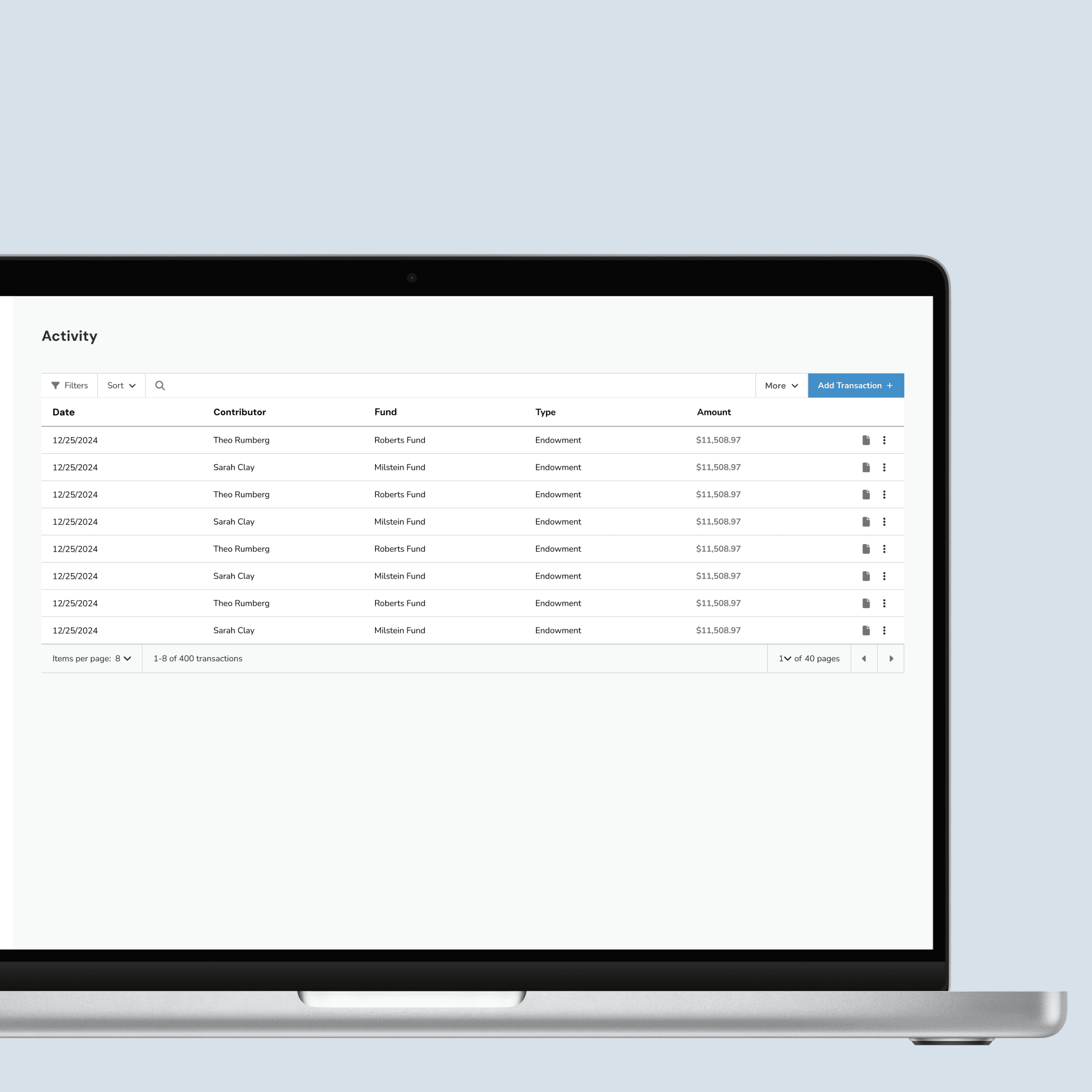
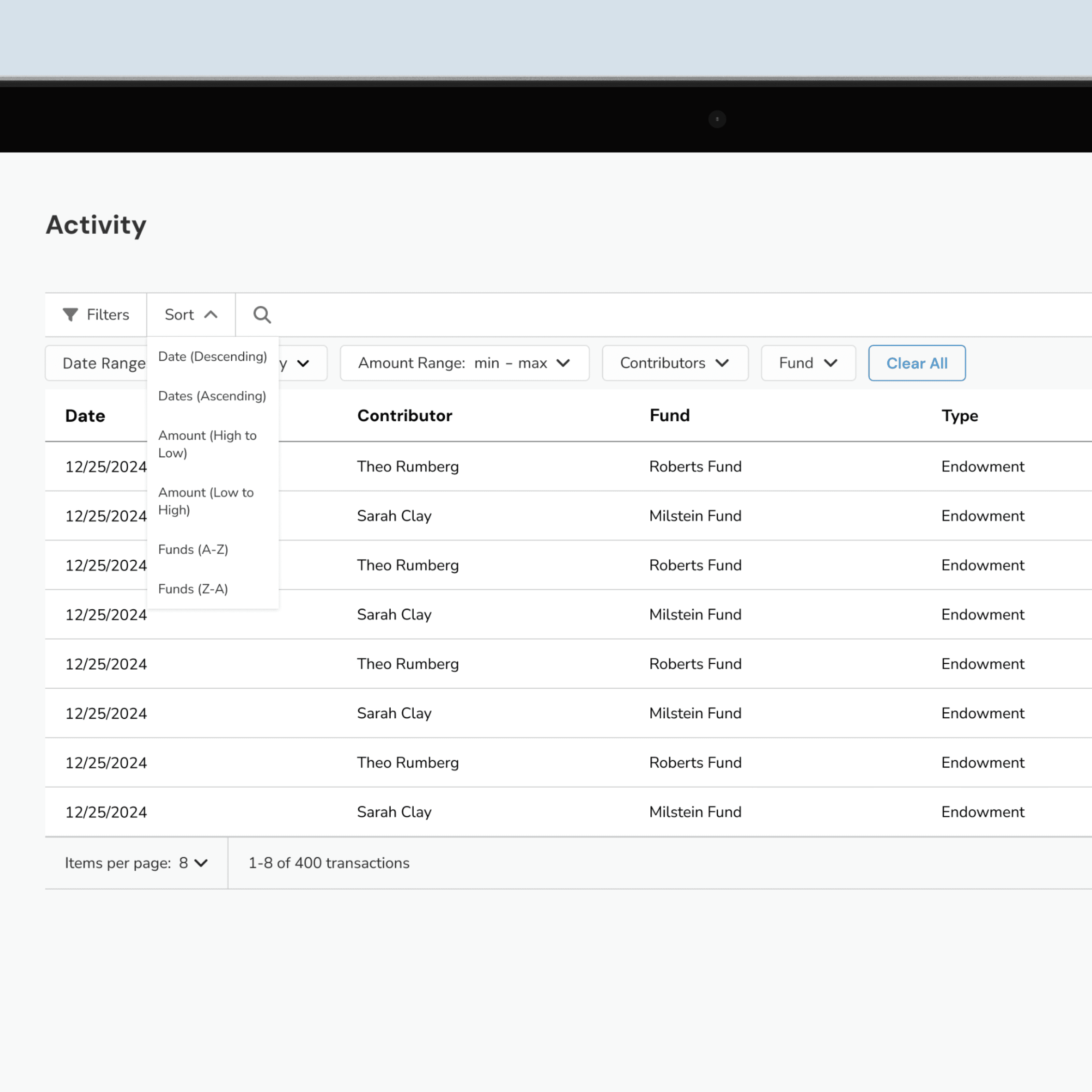
Smart Filters & Sort
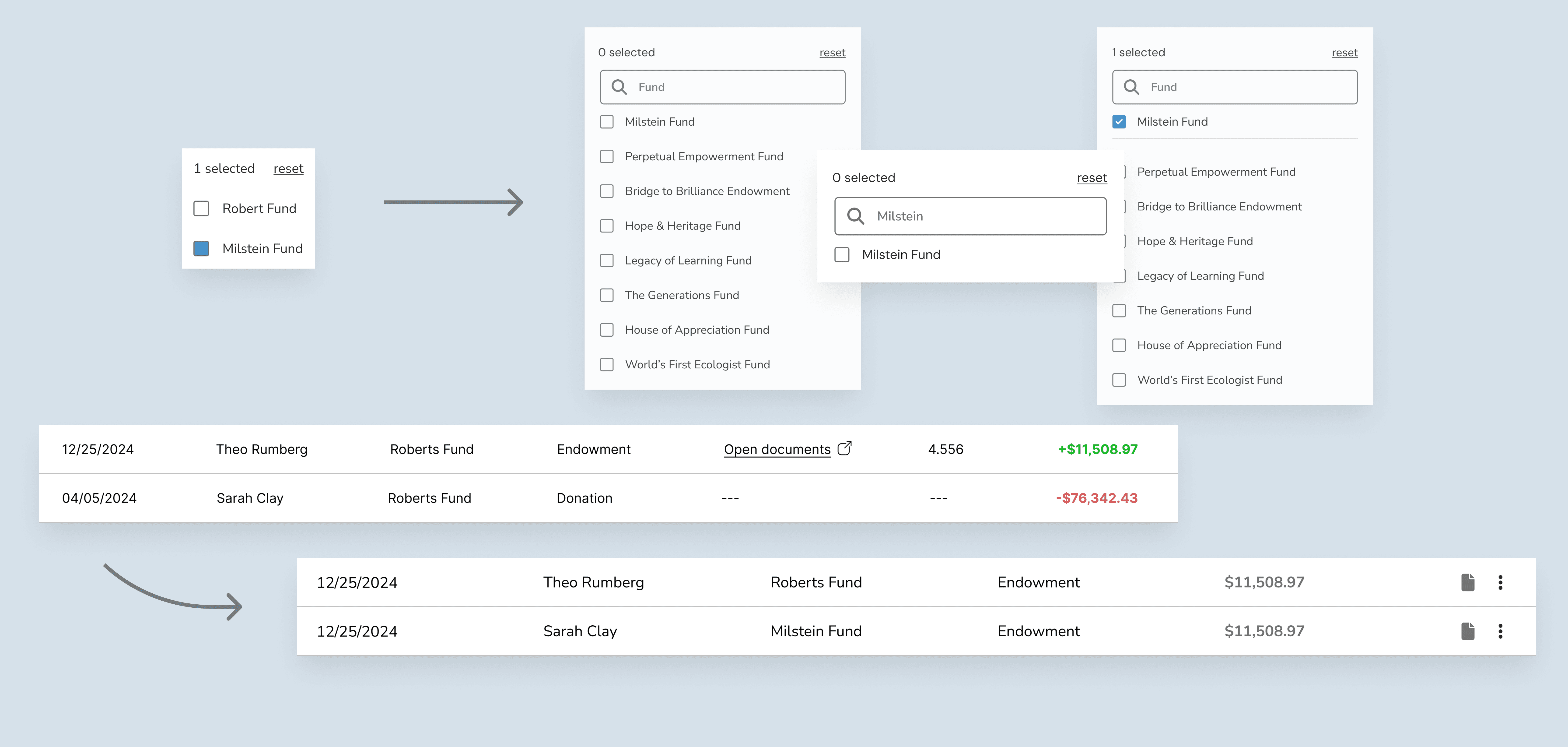
Quickly find what matters. The filtering system lets you zero in on specific donations by date range, amount, contributor name, or fund making it effortless to surface the records you need. Sorting adds another layer of control, letting you reorder by date, donation amount, or fund name to spot patterns or outliers. And when speed matters, the search bar helps you jump directly to the right entry.
More Menu
The More menu gives you deeper control over how you work. Export your current table for external reporting or import new data using a provided CSV template—making updates seamless and structured. Need a cleaner view? Customize lets you hide columns you don’t need, so you can focus only on the information that matters most.
DESIGN GOALS
Modernizing Designs
We refreshed the visual language to feel cleaner, more intuitive, and aligned with modern web standards—making every interaction feel familiar yet fresh.
From Accounting to Bookkeeping
By shifting our language from “accounting” to “bookkeeping,” we align terminology with everyday nonprofit workflows, reducing intimidation and increasing approachability.
Designing for Every Use Case
Whether you’re a first-time user, a long-time regular, or coming from a different platform, the experience is tailored for easy onboarding, quick familiarity, and minimal learning curves.
USER testing
Refining search and filters, shaped by the voices of those who use them every day
We interviewed over five nonprofit professionals—admins, analysts, bookkeepers, and donor specialists, whose insights guided our decisions in optimizing the experience for nonprofits of all sizes.
Activity Table
How the Table Found its Form
Early on, I decided to separate sorting from the table. All of our user interviews involved an older audience, so I wanted sorting to be both highly visible and accessible.
The following week, I spoke with our partner, David Strip, to ask if “Units” would be valuable for analysts. He replied: “While it may be useful, this data would constantly update and would require equations for each endowment.” Since this would be an expensive feature with limited impact, I decided to scrap it.
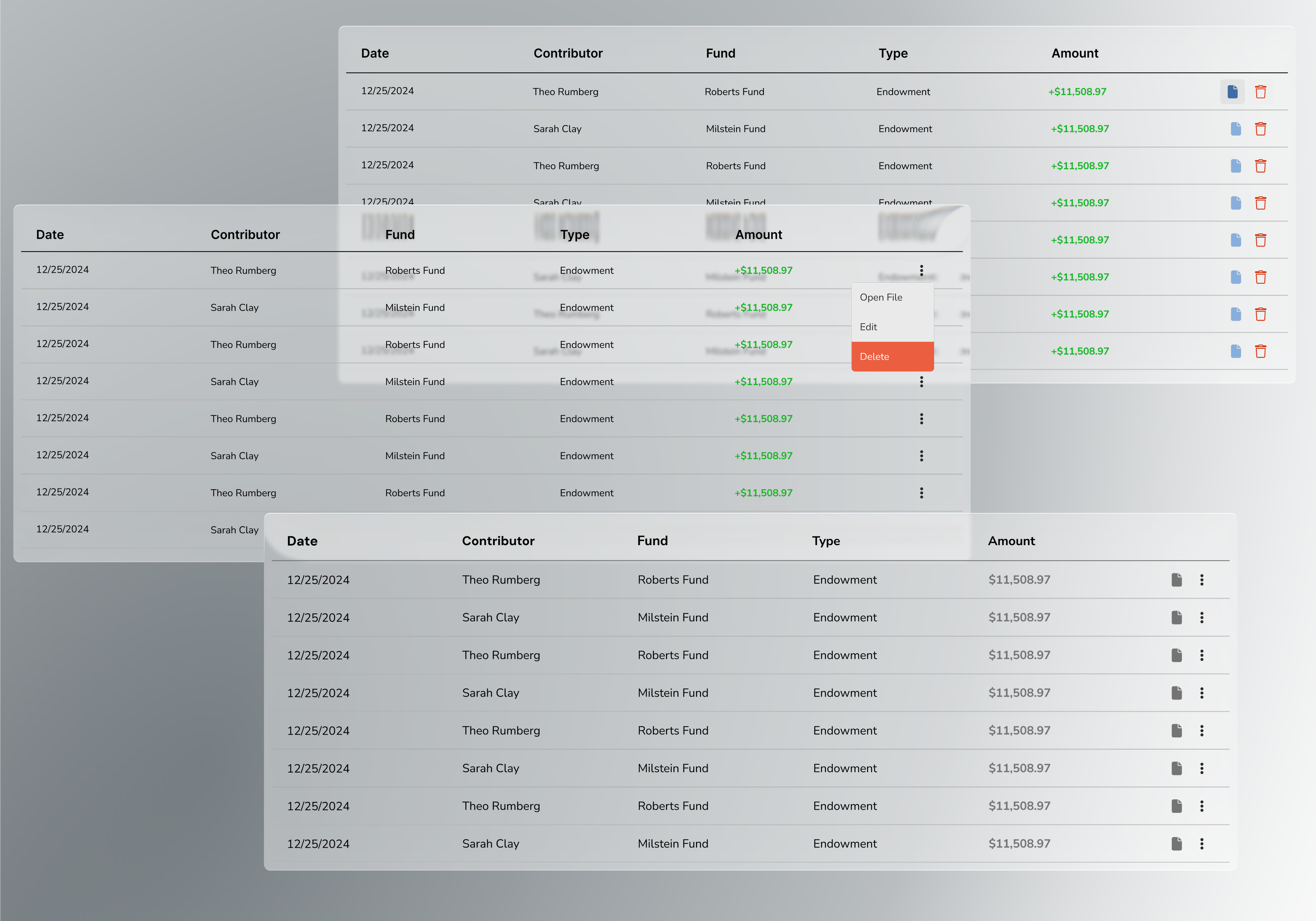
From there, the next iterations focused solely on features for individual transactions. Every transaction has important documentation, so I made that information readily available by placing it alongside other key details. In contrast, editing and deleting donations occur less frequently, so I intentionally made them harder to access by hiding them inside an ellipsis menu.
Finally, in my last design, I removed the +/- values in the “Amount” column—switching information from accounting to bookkeeping.
Filter & Sort
The Rhythm of Refinement
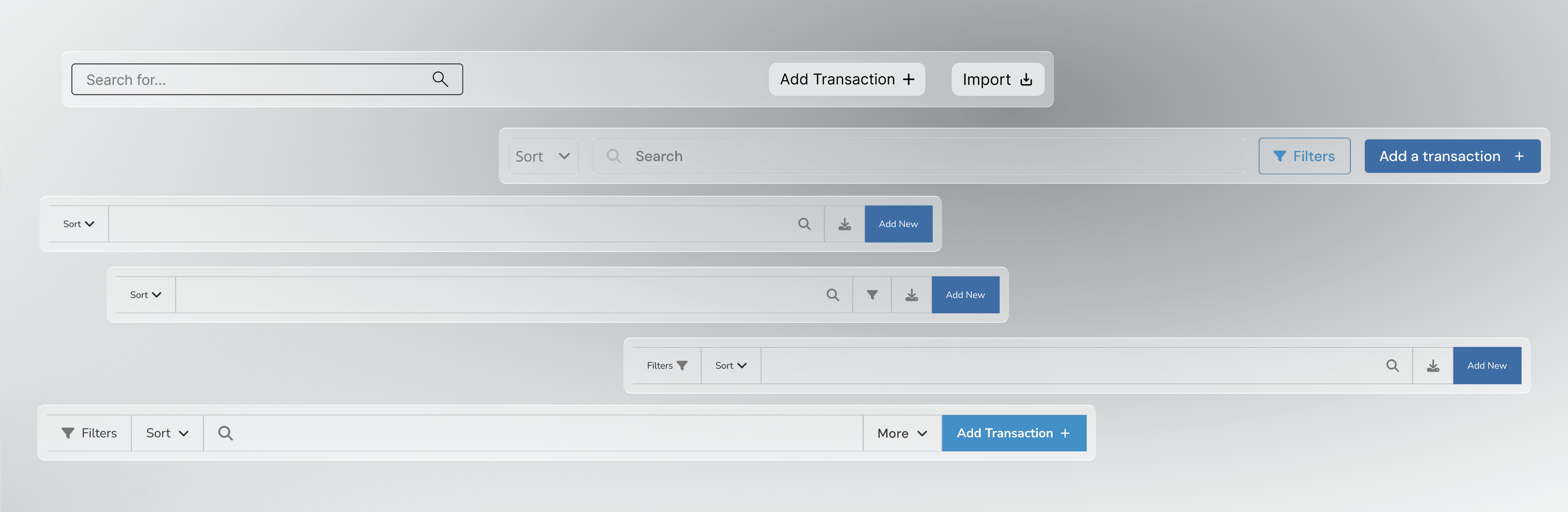
In modernizing the designs, I retained all the original features and refined them to a sleeker look. The 2 biggest additions were sorting and filtering through the rows. In addition, I compiled Import into a "More Menu" where in addition to importing past data from other programs, you can also customize your table to your liking and export the same table you are viewing.
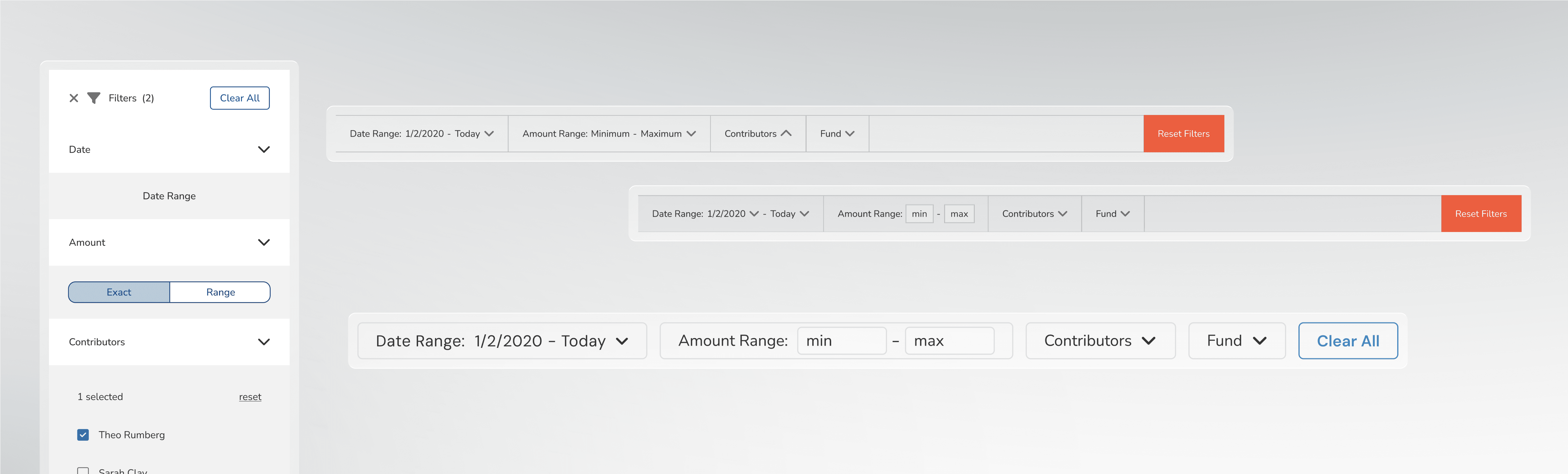
Next, I shifted my focus to how the filter options would be displayed. My research made it clear that four stood out as essential for anyone examining their activity: Date Range, Amount Range, Contributors, and Funds.
Date Range plays a crucial role during donation events, allowing a user to quickly see every transaction that occurred within that window. Amount Range, on the other hand, lets someone zero in on a very specific slice of data, depending on what matters in the moment.
Contributors and Funds each tell their own story. The Contributor filter reveals a donor’s history, helping track their engagement over time. The Funds filter shows how a specific fund has grown, letting users connect individual donations to a bigger picture.

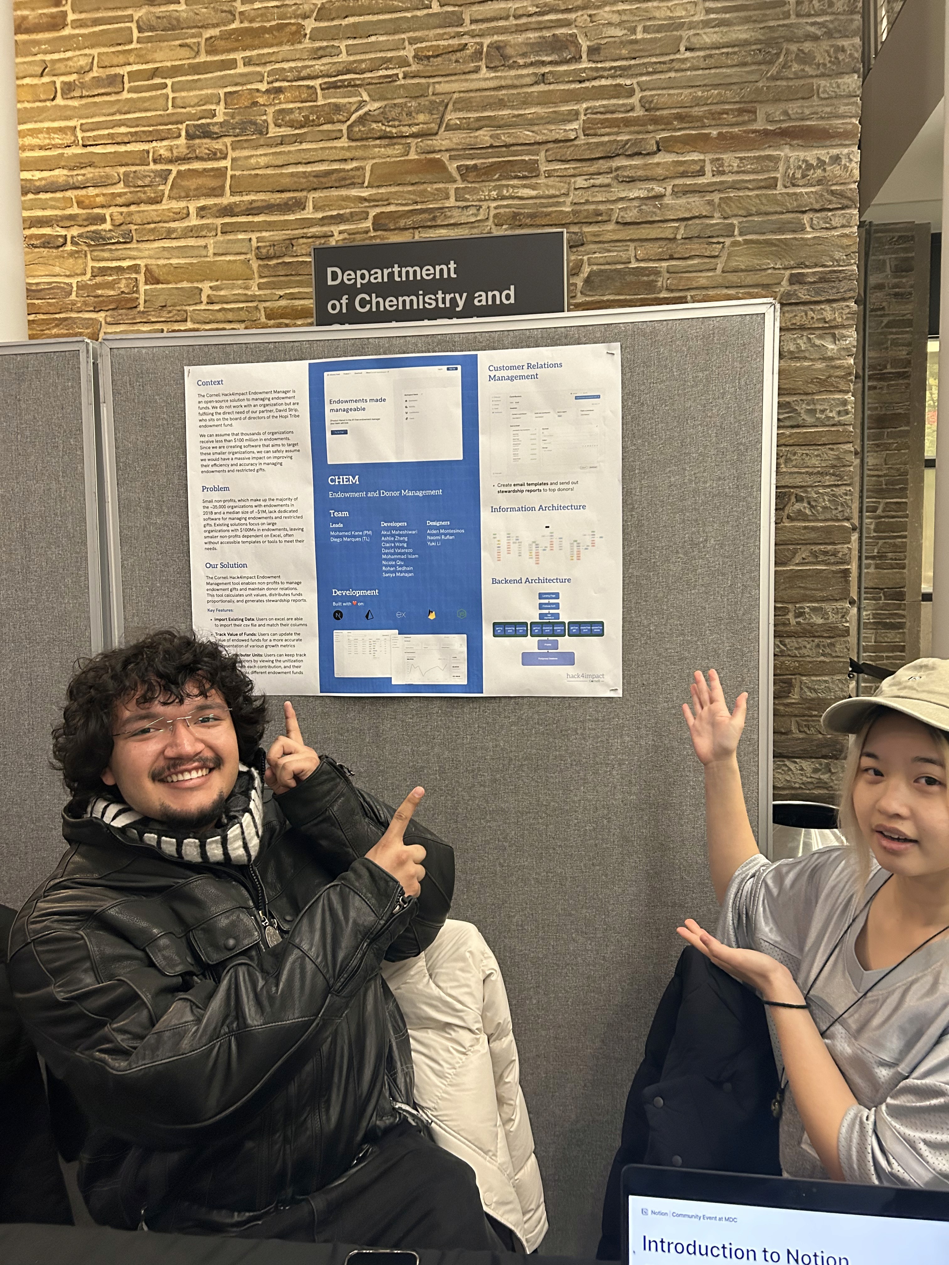
Dev/Designer Cooperation
My journey
Thrown into the deep end
Joining after the market research and UXR stage was both daunting and thrilling. I had to dive headfirst into months of prior work, quickly piecing together the project’s history. It pushed me to absorb information at a rapid pace and step into discussions with designers who had been immersed in the project far longer, sharpening my critique and adaptability skills.

Reflection
Collaboration
Working on my first group design project taught me how to navigate shared ownership, coordinate tasks, and build on each other’s strengths.
Public Speaking
Presenting in front of a crowd helped me practice communicating clearly, explaining my thought process, and defending design decisions with confidence.
Industry-Standard Design
I learned how to create dev-ready designs that developers can easily translate into code, bridging the gap between concept and implementation.
In Action
From screen to spotlight
Stepping beyond the canvas, we brought our ideas to life, sharing them with a buzzing crowd and turning curious eyes into engaged conversations.